We live in an unprecedented era of choice when it comes to the dice we use in our games. Every convention, many game stores, and even most podcasts and tournament report channels have their own unique set.
The dice produced by www.baronofdice.com are of exceptional quality and beauty, and everyone knows that when your click-clack math rocks are pretty, they have to roll better.
Before I talk a bit more about these, I want to make it clear that I have not been paid for this review, and I ordered these dice with my own money. I just really like them, and I wanted to shout out the website.
Grading Scale
I typically rate dice in about four different ways – size and style, readability, and aesthetic. These are all subjective of course, but I’ll attempt to justify my reasoning. I’ll rate each of them out of 5.
Size and Style
Baron of Dice uses my preferred size of dice for wargaming – 16 mm. Bigger than this and they become impossible to roll en masse or without a proper backdrop (looking at you 20 mm casino dice), and smaller than this they tend to get lost easily, bounce around too much, and be hard to read.
This size category has a ton of variation in it, as demonstrated below.


The truly mind blowing thing about the 16mm category is how different the rounding style can impact our perception of size. All six of the 16mm dice sit flush with each other on the top and sides if pushed together, but they all seem quite a bit different.
My personal preference is to have rounded corners on my dice. They feel better in the hand, are less likely to chip each other/any models they contact, and are easier to get a truly randomized roll with.
You can see here the difference between these dice and Tenzi dice. Interestingly enough, if you have enough dice in a bag, the rounded corners save enough volume to squeeze a few extra dice in there.

The main advantage the sharp corners have over the rounded ones have is the readability due to larger and more spread out pips. Normally when comparing Tenzi style dice to Chessex, the readability is noticeable.
The Baron of Dice style is a little less round than Chessex, which makes them feel a little bit bigger without actually increasing the size much. This lets the pips on the die be farther apart, which makes that readability issue much less severe.

This is actually the same style as the GW official dice for 9th edition, and I’m sure that this is on purpose. Using them with the official faction dice will feel seamless in the hand.

For me, the only kind of dice more pleasant for size and style than this are the extremely expensive 16 mm precision Backgammon Dice. These tend to be somewhere around $20 for a pair, and as Warhammer uses dozens of dice at a time, that would be truly silly.
Size and Style: 4.5/5
Readability
There are a number of important factors when it comes to dice readability. Size naturally matters, as bigger dice are easier to read. Size of pips or numbers also matters as, once again, the bigger the better usually. Contrast between the pip/number and the dice body is also key as low contrast will be harder to read.

Additionally, transparent dice are almost always less easy to read as multiple faces of the die show at once. The last, and perhaps the most surprising factor, is pips vs. numbers. Most people can identify the pattern of pips much more quickly than they can identify a number – especially en masse as is needed for a game like Warhammer.
Here are some examples of dice with low readability next to these from Baron of Dice.

And here are a whole bunch of different options laid out in my opinion from least readable to most.

As we can plainly see, the Chaos Knights die ranks pretty high on my scale, and the last three dice are all variations of “very good”. Other styles made by Baron of Dice would rank even above the T’au dice, and the trade off between these Chaos Knight dice and the top tier are pretty minimal for how attractive the resin mix is.
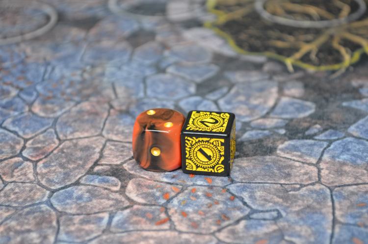
Here are some shots of the dice on the board – clearly visible and easily readable even at a distance.


While you might have some issues with these if you play on a lava map a lot, in general these guys are extremely useable from anywhere on the table.
Readability: 4.5/5
Aesthetic
This is the most subjective of the bunch, but Baron of Dice is definitely following established color combinations that tend to be right up people’s alley. Red/Gold with some black accents has been and continues to be a favorite color combination for many people, and it looks stunning on these dice.
I’ve posted a ton of pictures of them here, and I think they look fantastic. In case you aren’t quite convinced yet, here are some more!


I am very impressed with both the look and the quality of these dice, and I would not hesitate to recommend them to anyone looking to pick up some faction dice of their own from www.baronofdice.com.
Aesthetic: 5/5
Conclusion
When I started writing this article, I expected it to be a few hundred words at most. Then I discovered that I have opinions about dice and the piece you’ve just read came into being.
These are excellent, premium dice. They are a different breed than regular Chessex dice in both die shape and matching of faction identity. There are tons of varieties to choose from, shipping was prompt and well packaged, and I have no hesitations about ordering from this site again. Who knows, maybe I’ll need some for my next faction too!
In any case, in case you’ve forgotten you can find these and many other varieties of 40k inspired dice here, and until next time, thanks for reading!

